Wonder belongs to everyone
Top priority. Front and center.
We design for every visitor, on every page
Cultural organizations are built to welcome. Their websites are part of that welcome, often the very first door a visitor opens. Every ticketing page, donation form, member portal, and kiosk we build is shaped to hold that door open just as wide as the lobby beyond it.
That’s why accessibility isn’t a separate workstream here. It’s the first thing we test, the last thing we ship, and the standard we hold ourselves to in every release. On this site, in our checkout flows, and in every product we put into the hands of the organizations we serve.
Who we build for
Every visitor counts
Arts and culture serve the full breadth of a community. Our platform has to do the same.
Visitors with mobility differences
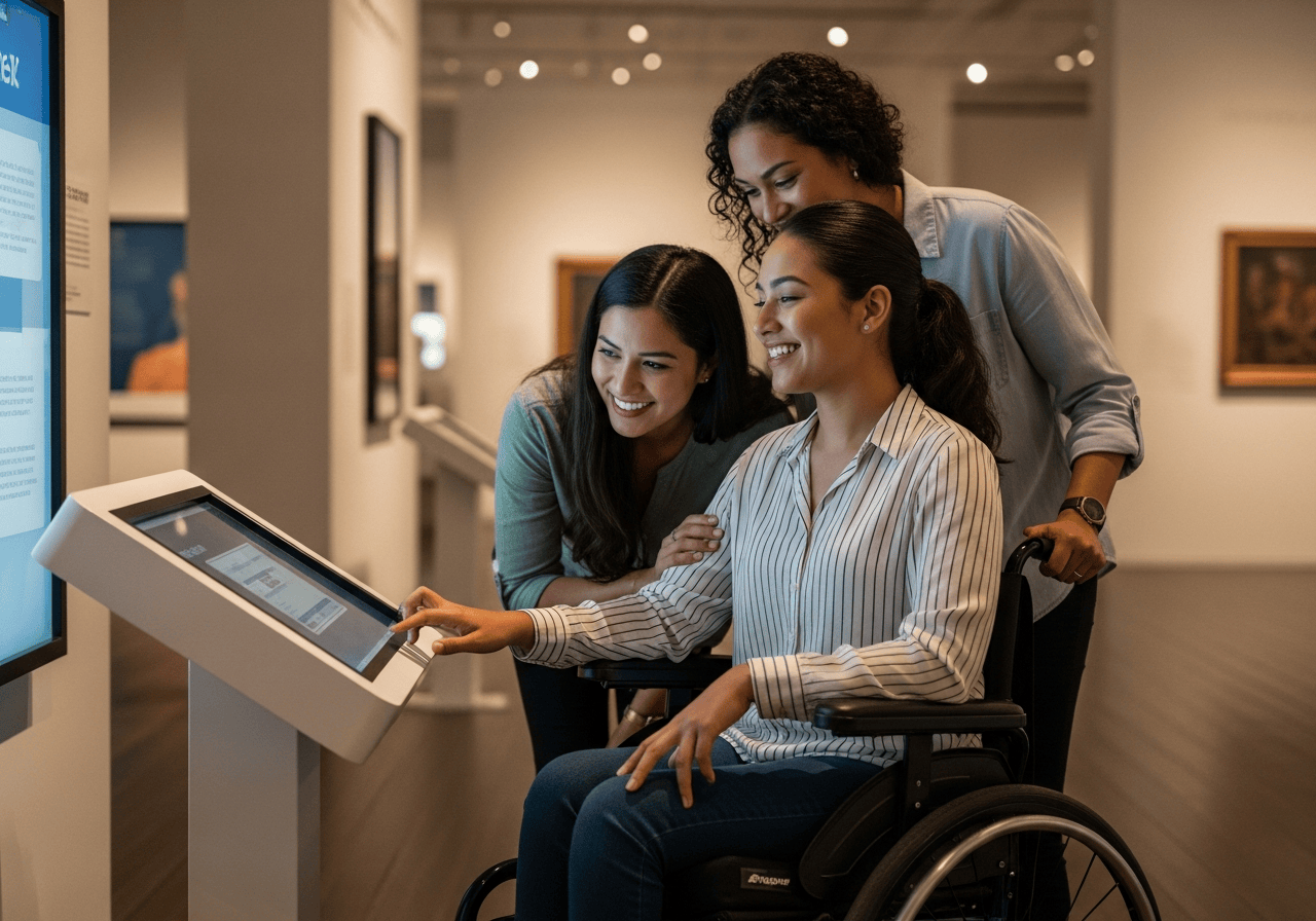
Wheelchair users, people on walkers, parents pushing strollers, anyone who navigates one-handed. Every flow on every screen completes without standing up or two-finger gestures.
Blind and low-vision visitors
Full screen-reader support, semantic landmarks on every page, AA-conformant contrast, and text that scales to 200% without breaking the layout.
Deaf and hard-of-hearing visitors
Captions on every video, transcripts where audio carries meaning, and visual confirmation for every action so no one waits on a sound that never arrives.
Cognitive and neurodivergent visitors
Plain language, predictable navigation, generous timing, and respect for prefers-reduced-motion, with built-in support for sensory-friendly events and quiet hours.
Visitors with temporary or situational limits
A broken wrist, a sleeping baby held in one hand, a sunlit phone screen, a noisy lobby. The design that helps a permanent need on Tuesday helps a temporary one on Saturday, for everyone.
Aging visitors
Generous touch targets, large readable type, clear labels, and forgiving error states. As eyes change and reflexes slow, the experience should stay easy, not turn into a quiz.
The standard
We build to WCAG 2.1, Level AA
The Web Content Accessibility Guidelines (WCAG) 2.1 are published by the World Wide Web Consortium’s Web Accessibility Initiative (W3C WAI). They are the international standard for making digital experiences usable by people with disabilities, and they are the standard that U.S. courts, the Department of Justice, and most state procurement rules cite when evaluating accessibility.
WCAG 2.1 organizes accessibility around four principles: content must be Perceivable, interfaces must be Operable, language and behavior must be Understandable, and code must be Robust enough to work with current and future assistive technology.
We target Level AA. That’s the level regulators, advocacy groups, and the disability community treat as the minimum bar for public-facing digital products.
- ✓ Perceivable. Alt text, captions, contrast, and content that adapts to how a person reads.
- ✓ Operable. Keyboard access, generous timing, no seizure-inducing motion, clear focus.
- ✓ Understandable. Plain language, predictable navigation, helpful error messages.
- ✓ Robust. Clean, semantic code that works with screen readers, switches, and what comes next.
How we build it in
The practices behind the promise
Accessibility isn’t a separate workstream. It’s baked into how every page, component, and flow ships.
Semantic HTML and ARIA
Every page is shaped for assistive tech first. Headings, landmarks, roles, and states are right because the markup is right, not patched in afterward.
Keyboard navigation
Every flow (ticket purchase, donation, member sign-in, event registration) completes from a keyboard alone, with visible focus and skip-to-content links on every screen.
AA-conformant contrast
Body text meets WCAG 2.1 contrast ratio 4.5:1. Large text and UI components meet 3:1. We check it on every component, not just the homepage.
Captions and transcripts
Every video has captions. Every audio asset has a transcript. Auto-captions are a starting point, not the finish line. We review them.
Resizable, reflowable content
Text scales to 200% and content reflows to a 320 px viewport without horizontal scrolling or lost meaning. Mobile and zoomed-in desktop are first-class.
Reduced motion and forgiving forms
Animations honor prefers-reduced-motion. Every input has a label. Every error tells you what went wrong and how to fix it, without losing your place.

The same wonder
Every visitor deserves the same moment of wonder
The first time a child sees a coral reef. The first time a teenager finds an artist who finally makes sense of them. The grandmother who hasn’t been somewhere this beautiful in years. None of those moments should be smaller because of how a person sees, hears, moves, or thinks.
Accessibility, done right, is invisible. The screen reader announces what it should. The video has captions before anyone has to ask. The path through the gallery is wide enough, the form forgiving enough, the language plain enough that the experience disappears and the wonder takes over.
That’s the bar. We don’t always clear it, but it’s the bar we hold ourselves to on every page, every release, and every product we put into the hands of the organizations we serve.
If you find a barrier, tell us.
We won’t get this perfect, but we’ll keep trying
Standards evolve. Browsers change. Our team makes mistakes. If something on this site, on a ticketing page we power, or on a platform we’ve built keeps you from where you wanted to go, please tell us.
We treat accessibility reports as priority work. We’ll respond, we’ll fix what we can, and we’ll tell you honestly when something is going to take longer than it should.
See it in action
Get started with Social Good
Schedule your one on one demo to see the software in action.
Get started